
ye brand book
myth, made tangable.
00

how do you design rules for someone who never follows them?
the problem
kanye west’s brand identity has shifted constantly throughout his career. there was no unified visual system that could tie together his work, ideas, and evolving aesthetics. the challenge was to create a brand book that felt true to his unpredictable creativity while still functioning as a clear, cohesive guide.
the solution
i developed a structured yet flexible brand book that captures kanye’s raw, experimental energy. from a custom logo system to a bold color palette and unconventional merchandise concepts, the book establishes a visual language that feels both iconic and intentionally unfinished — a system built to evolve, just like the artist it represents.
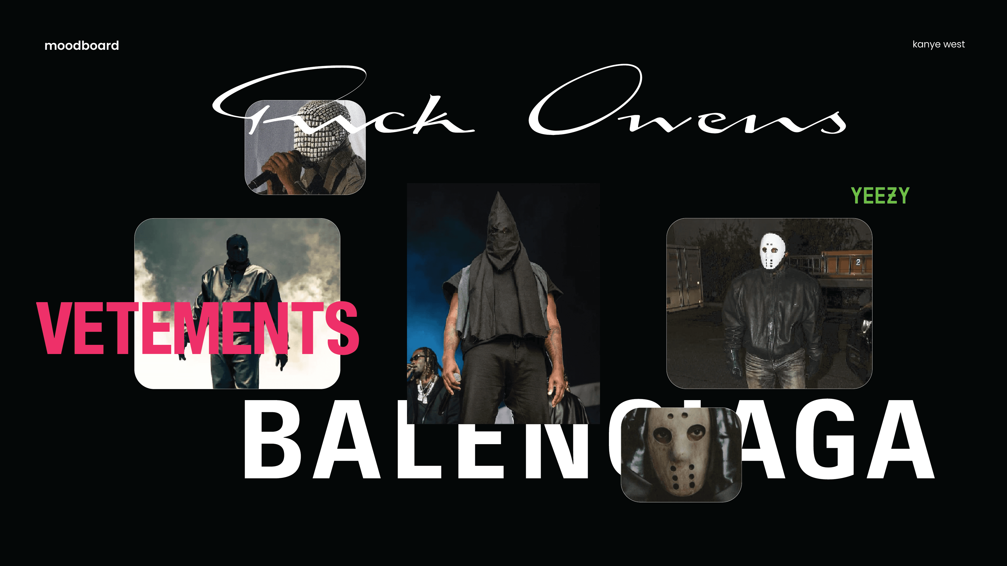
I began by studying the patterns within Kanye’s chaos: album eras, fashion lines, stage design, and the visual symbols that repeat across his work. Instead of trying to tame his identity, I chose to embrace it.
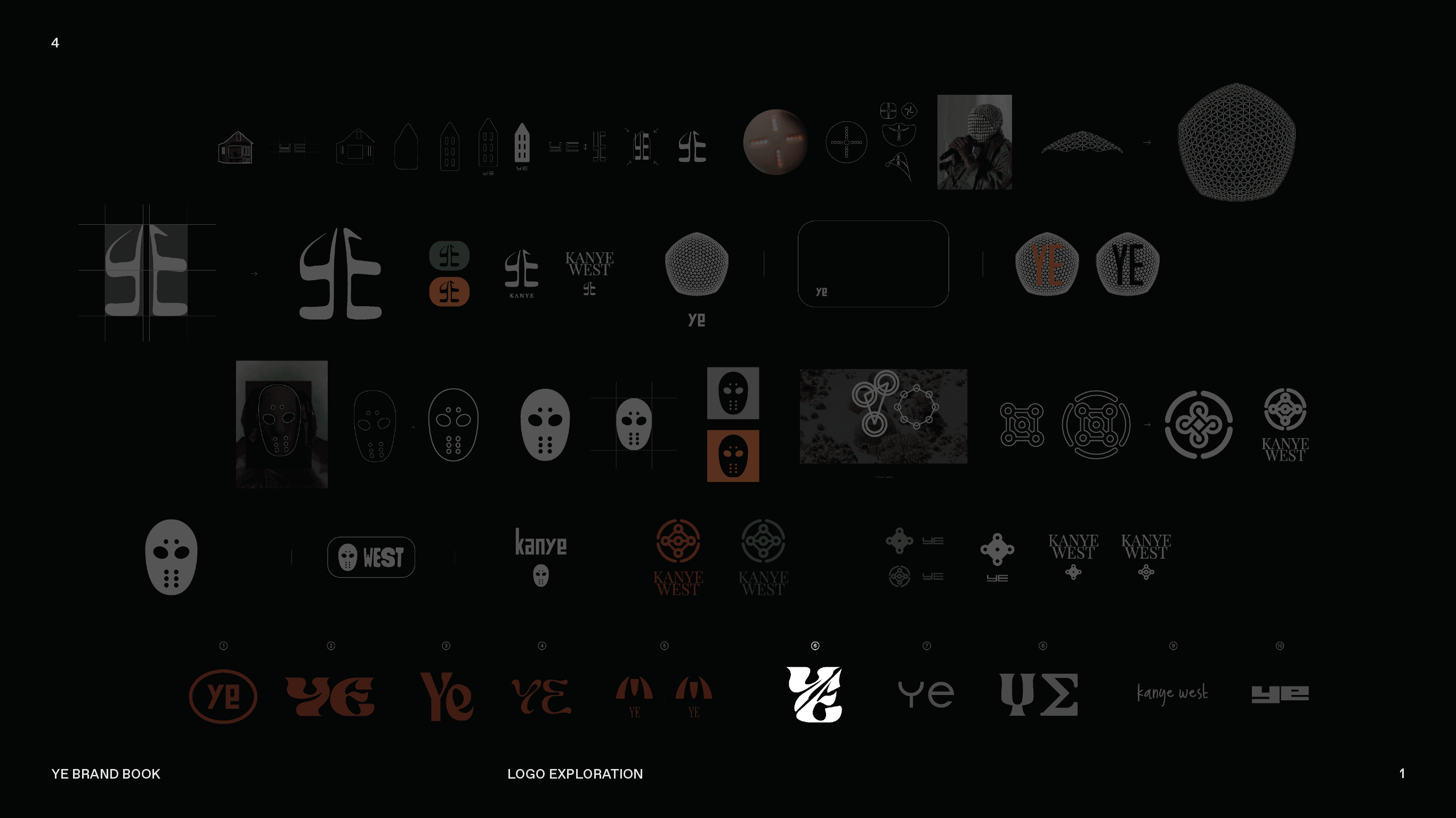
the logo came first, built from sharp, minimal forms that could expand in multiple directions. from there, the color palette grew out of the moods of his albums, muted tones from Yeezus, earthy hues from Donda, and vibrant accents inspired by Graduation.
In the end, the book isn’t just guidelines, it’s a narrative of experimentation. It reflects a process of breaking the idea of a “brand book” and rebuilding it through Kanye’s lens: bold, strange, unexpected, and unapologetically confident.
01

02

03

04

05

06

07

08

see also


